Border-radius: 50% vs 100%
Lately, I’ve been trying to reexamine some of the CSS rules I’ve taken for granted in my career. I’ve written a lot of code without really understanding the reason why; I’ve simply accepted certain ways of doing things as common practice. Or, I may vaguely know the reason, but some of the details of browser implementation are fuzzy because I haven’t really read the specs. I’m trying to ask myself “Why?” as much as possible, and this practice has led to many lightbulb moments that I hope to share with others.
Perfect circles in CSS
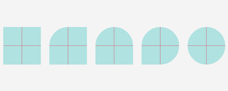
A common design pattern we see on the web is a perfect circle, sometimes with a background color or an image inside.

This is often achieved by using CSS’s “border-radius” property. The way I’ve always done it is to create a square, and then set the border radius to 50%. I’ve never really questioned this; I’ve simply accepted that setting the radius to half the height/width of the square on all the corners would create a circle.
Here is a 150px by 150px square that transforms into a circle by setting each corner’s border radius to 50%. According to the W3C’s section on border radius, percentage-based units for border radius refer to the width and height of the border box. In my example, the width/height of the border box is 150px, so 50% would return a computed value of 75px.
How does border-radius really work?
But sometimes I see the same design pattern accomplished by setting the border radius to 100%. I did it myself in a project a few days ago, without even thinking. It looks exactly the same, by forming a perfect circle. Why?
In Lea Verou’s presentation, The Humble Border Radius, she points out the W3C rules on overlapping curves: if the total border radius for 2 adjacent corners exceeds the size of the border box, the browser does some additional computation to proportionally scale each corner’s border radius until they don’t overlap.
If the top left border radius of the square is set to 100%, the radius stretches from the bottom left corner to the top right corner of the square. This is the same as setting the border radius to 150px, the size of the square. And if the top right border radius is also set to 100%, the total of the 2 corners is now 200%. The browser says, “That’s not allowed—make some room for the right corner!” and scales both radii until they fit inside the square. At this point, each corner is now half of 100%.
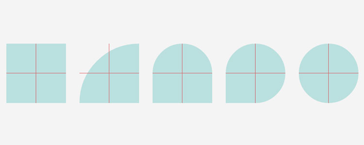
The browser will scale all the other corners down as well, so each corner has a 50% radius until we get our circle. Even if you specified 150px for each corner’s radius, the actual computed radius would be 75px, because that is the maximum that the browser will allow for each corner.
Conclusion
If the border radius for all corners is set to 100%, the browser does some extra work behind the scenes to scale the corners down until they fit. I’m not sure if there are any performance implications to setting border radius to 100% on all your circles.
At the very least, it seems like a pretty pointless practice as long as you know ahead of time that the browser is going to scale the radii down to 50% anyway. Using 50% seems to be the way to go.
Time for me to go fix that random CSS from last week…