Create Headings with Lines in CSS
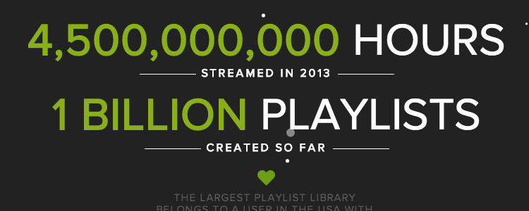
A popular web design pattern is to include horizontal lines on either side of a line of text, often in a heading. An example of this style is the subheading treatment in Spotify’s Year in Review:
There are many different ways to accomplish this via CSS. Many people before me have collected examples for this very issue, but I figured one more couldn’t hurt.
For the purposes of this demonstration, I’ve left off the vendor prefixes.
1: Pseudo-Elements with Nested Span
HTML
<h1><span>Title</span></h1>
CSS
h1 {
  position: relative;
  text-align: center;
}

h1 span {
  background: #fff;
  padding: 0 15px;
  position: relative;
  z-index: 1;
}

h1:before {
  background: #ddd;
  content: "";
  display: block;
  height: 1px;
  position: absolute;
    top: 50%;
  width: 100%;
}

h1:before {
  left: 0;
}
This method uses a pseudo-element to place a 1px high line before the heading. The line takes up 100% of its container. The span then uses a background color and some padding to sit on top of the line, so it looks like there are two lines on either side of the heading.
2: Inline Block Heading with Container
HTML
<div class="container"><h1>Title</h1></div>CSS
h1 {
  display: inline-block;
  padding: 0 15px;
  position: relative;
}

h1:before,
h1:after {
  background: #ddd;
  content: "";
  display: block;
  height: 1px;
  position: absolute;
    top: 50%;
  width: 400%;
}

h1:before {
  right: 100%;
}

h1:after {
  left: 100%;
}

.container {
  overflow: hidden;
  text-align: center;
}This method is similar to #1, with a few small differences. The heading has been set to display: inline-block, which means it won’t take up 100% of its container. That in turn means the pseudo-elements being used for the lines need to be longer if you want them to stretch across the page. I’ve used an arbitrary 400% here, but that width would likely need to be adjusted for various container sizes. Lastly, this method assumes you don’t mind setting overflow: hidden on a container around the headings.
Bonus: This method will work on headings with multiple lines of text.
3: Nested Span and Gradient
HTML
<h1><span>Title</span></h1>CSS
h1 {
  background: linear-gradient(top, #fff 0%, #fff 50%, #ddd 50%, #ddd 50.5%, #fff 50.5%, #fff 100%);
}

h1 span {
  background: #fff;
  padding: 0 15px;
}
This time, the CSS is much more concise. The heading contains a linear gradient that starts from the top, with color stops right around 50% from the top to create the horizontal line. This technique still requires an extra span with a background color to lie on top, in order to create the illusion of two lines.
4: Nested Span and Border
HTML
<h1><span>Title</span></h1>CSS
h1 {
    text-align: center;
    border-bottom: 1px solid #ddd;
    line-height: 0;
    padding: 0;
}

h1 span {
    background: #fff;
    padding: 0 15px;
}
This method, proposed by CSS Tricks user @kevinthompson, sets the heading’s line height to 0 and gives it a border. Once again, a span with a background color is needed. The line height might give you trouble if you have a long title, but this method is short and sweet for titles that are also short and sweet.
5: Table Cell and Gradient
HTML
<h1>Title</h1>CSS
h1 {
  display: table;
  white-space: nowrap;
  width: 100%;
}

h1:before,
h1:after {
  background-clip: padding;
  background-image: linear-gradient(transparent 49%, #ddd 50%, #ddd 51%, transparent 51%);
  content: "";
  display: table-cell;
  width: 50%;
}

h1:before {
  border-right: 15px solid transparent;
}

h1:after {
  border-left: 15px solid transparent;
}
This method, proposed by CSS Tricks user @kevinthompson, sets the heading’s line height to 0 and gives it a border. Once again, a span with a background color is needed. The line height might give you trouble if you have a long title, but this method is short and sweet for titles that are also short and sweet.
6: Flexbox
HTML
<h1>Title</h1>CSS
h1 {
  display: flex;
  flex-direction: row;
  justify-content: center;
  text-align: center;
}
h1:before, h1:after {
  background-color: #ddd;
  content: '\a0';
  flex-grow: 1;
  height: 1px;
  position: relative;
  top: 0.5em;
}
h1:before {
  margin-right:10px;
}
h1:after {
  margin-left:10px;
}The flexbox example was proposed by Jonathan Snook. In it, the heading is defined as a flexbox container with display: flex. Additionally, the heading’s contents flow left to right with flex-direction: row and are horizontally centered with justify-content: center.
If you haven’t used the flexbox layout on a project before, you should give it a try—it’s pretty neat! Chris Coyier has a helpful guide to how it works.
Summary
As you can see, there are a ton of ways to achieve this little visual trick, and I’ve only covered a few. I’m partial to the methods that use less markup, so I can keep my HTML free of extra tags that are used only for presentation. Browser support may vary, so you should pick your poison according to your needs.
If you have a favorite method, please feel free to share with me on Twitter.